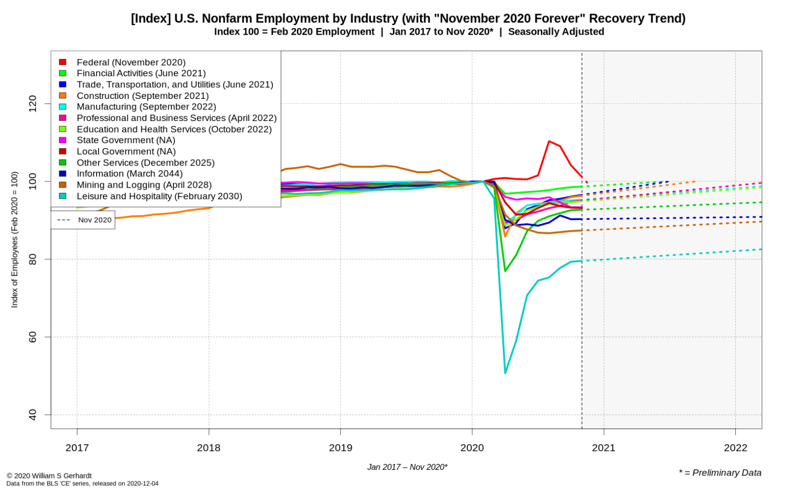
The COVID-19 employment roller coaster just took another turn, and the job growth we saw in Summer and Fall 2020 appears to be at an end.
Tag Archives: BLS
Graphical Analysis: New State Job Numbers Show a Nation in Flux
In this post I take a look at the new September 2020 state-level employment data provided by the Bureau of Labor Statistics (BLS) and find a complex and tenuous jobs recovery in America. I share some of the most interesting numbers in original graphs.
Employment Trends: A Full Recovery in 2020 is Possible, but may be Unlikely
While employment growth slowed in September 2020, the industry employment numbers over the summer suggest that an American labor market, without COVID-19, could quickly rebound. I explore some different employment growth scenarios.
The September 2020 National U.S. Employment Numbers in Four Graphs
The major takeaways: All sectors but the Federal Government are still down significantly from their peak employment on February 2020; only the Financial Services sector is close to being “recovered”; the Leisure and Hospitality sector is continuing to suffer from double-digit employment losses but is growing quickly.
Graphical Analysis: State-Level U.S. Employment is Failing to “Bounce Back”
I look at the August 2020 state-level employment data from the Bureau of Labor Statistics (BLS) and find generally lackadaisical employment numbers in both large and small states. This is my first look at the state-level and local-level data provided by the BLS, and was done using original data tools that can process and manage large multi-dimensional time series datasets.
Graphical Analysis: The June 2020 U.S. Industry Employment Highlights
The mostly recent Bureau of Labor Statistics data shows that in May and June of this year the U.S. Economy may have recovered 36% of the jobs lost during in the first wave of COVID-19 shutdowns. Now, as public spaces are shutting down for a second time, I look at what happened last month in colorful and original graphs.
Explained: The Data Engineering techniques used in my “Spring Job Losses” post
If you want to know how I crunched the numbers and generated the original graphs in my last graph-loaded blog post, here is an overview of my methods.
Data Analysis: A Graphical Tour of the Preliminary COVID-19 Spring Job Losses
On Friday the Bureau of Labor Statistics released their first preliminary estimates for May 2020 industry-specific employment. The numbers provide a preliminary snapshot of what happened to the U.S. job market in the second full month of the United States COVID-19 epidemic. I share some highlights with original graphs and charts.

